Exercises in Accessibility — publication — 2022
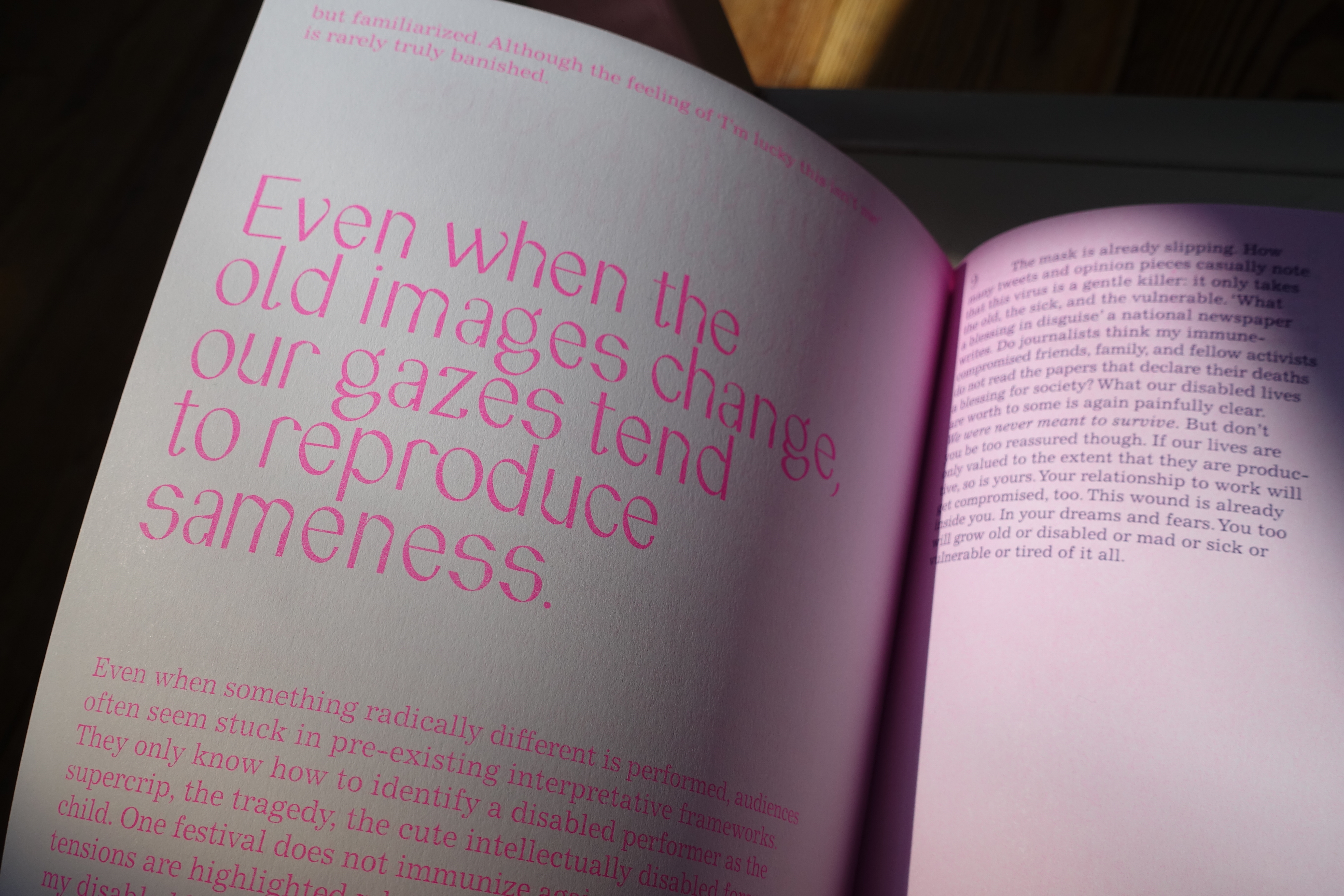
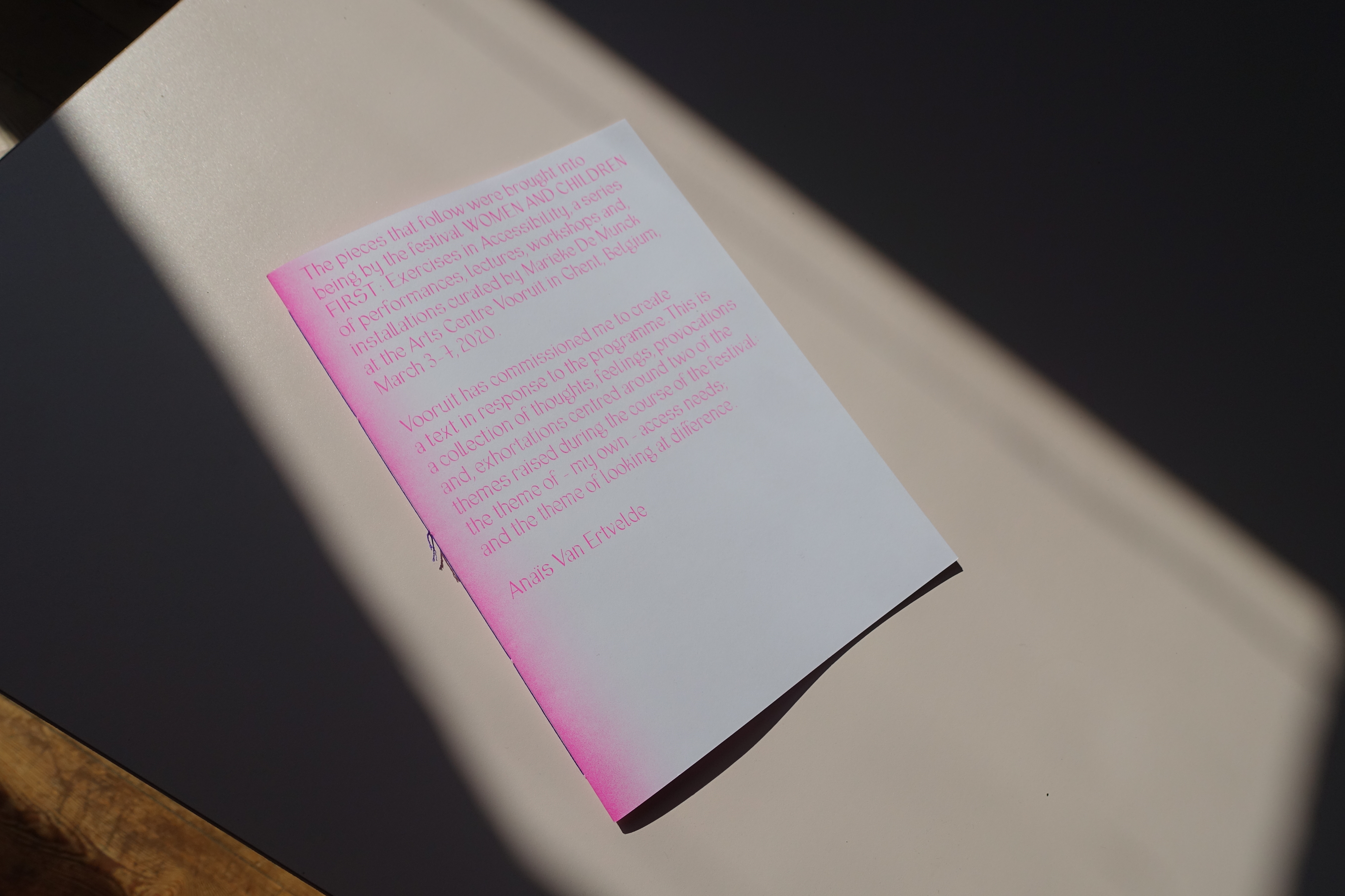
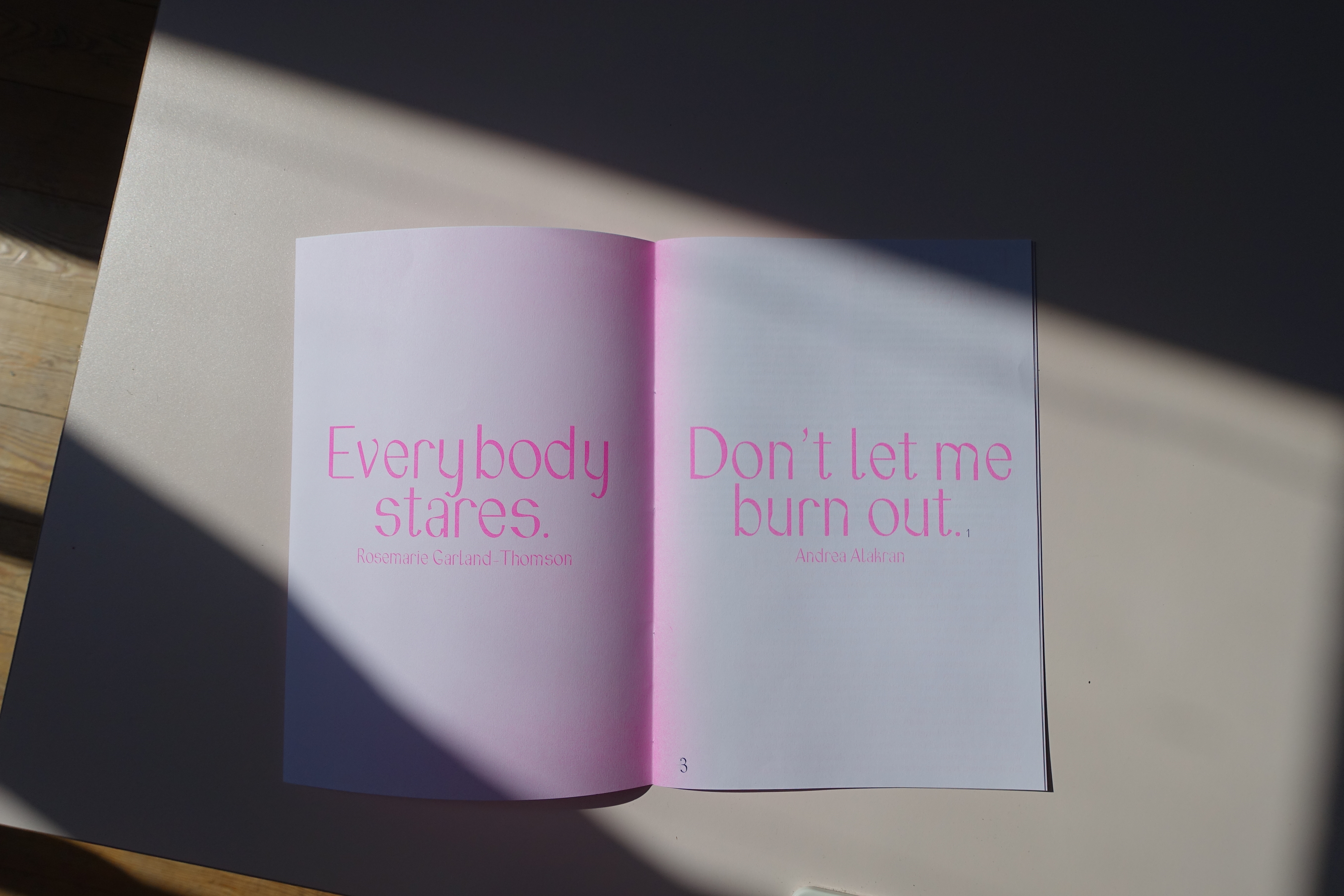
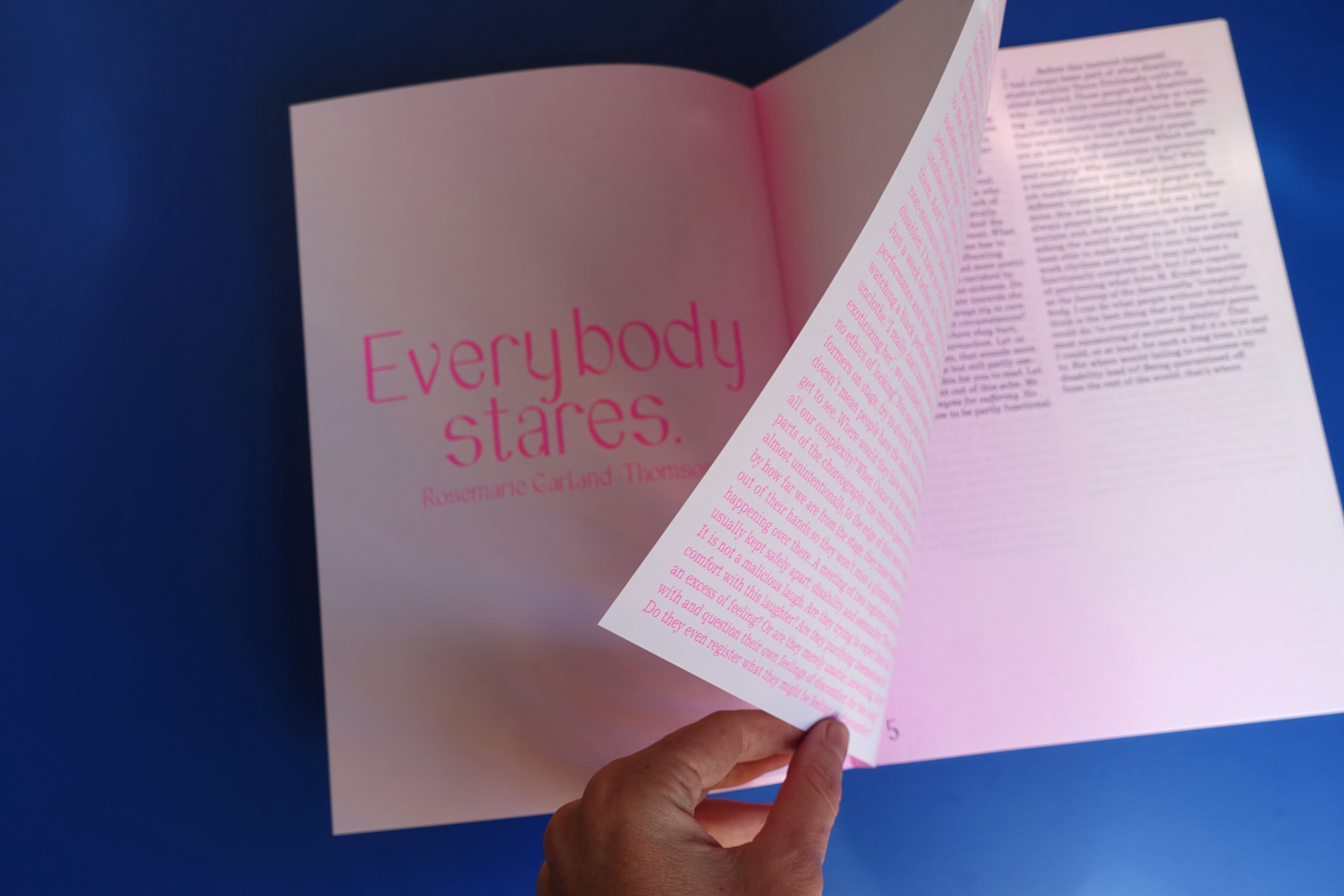
Publication design for a text by Anaïs Van Ertvelde who wrote a collection of thoughts, feelings, provocations and exhortations centred around two of the themes raised during the course of the festival ‘Woman and Children First’: the theme of – her own – access needs; and the theme of looking at difference.
18 pages
soft cover, cahier stitch
risoprinted by Topo Copy
21 x 29,7 cm
18 pages
soft cover, cahier stitch
risoprinted by Topo Copy
21 x 29,7 cm