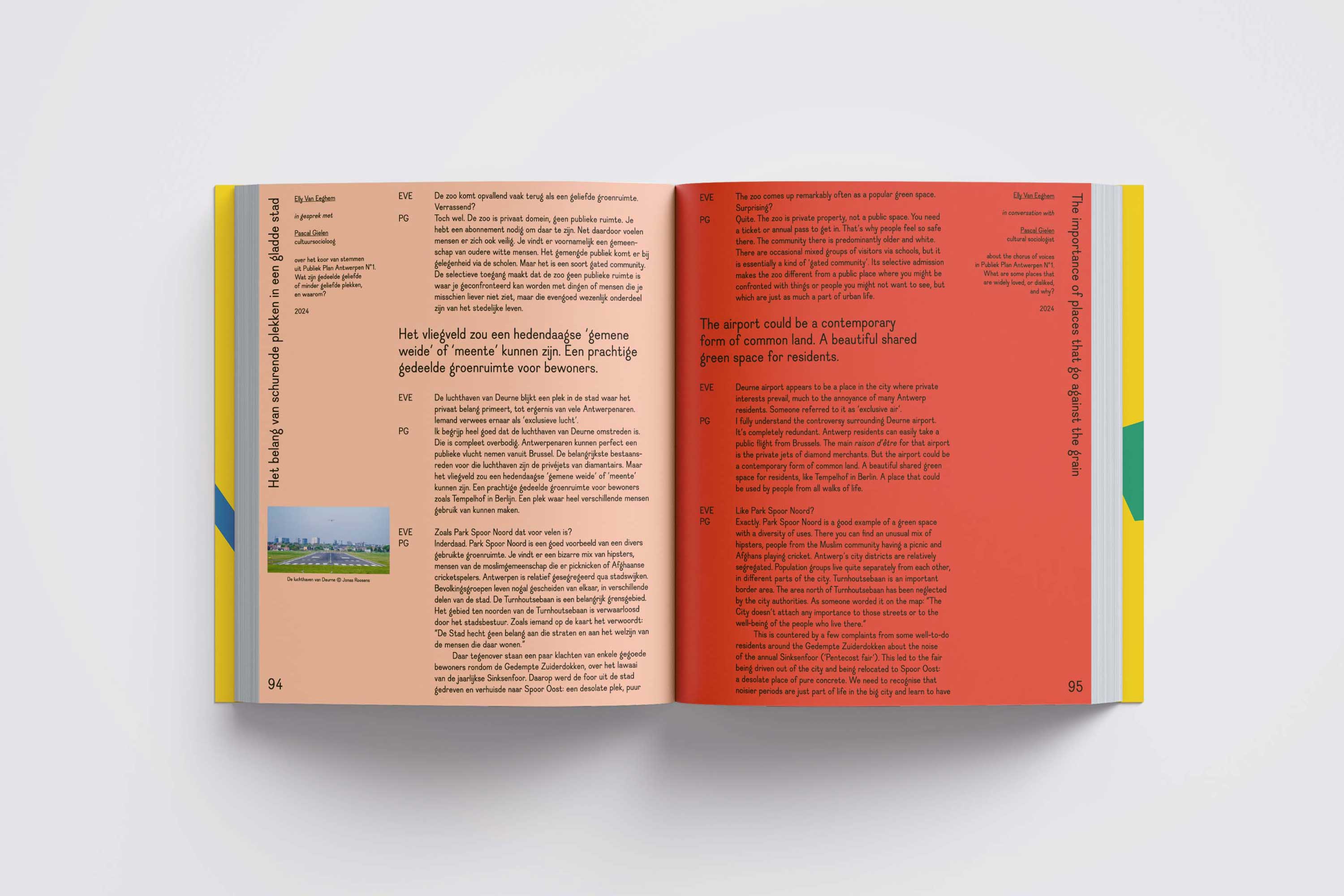
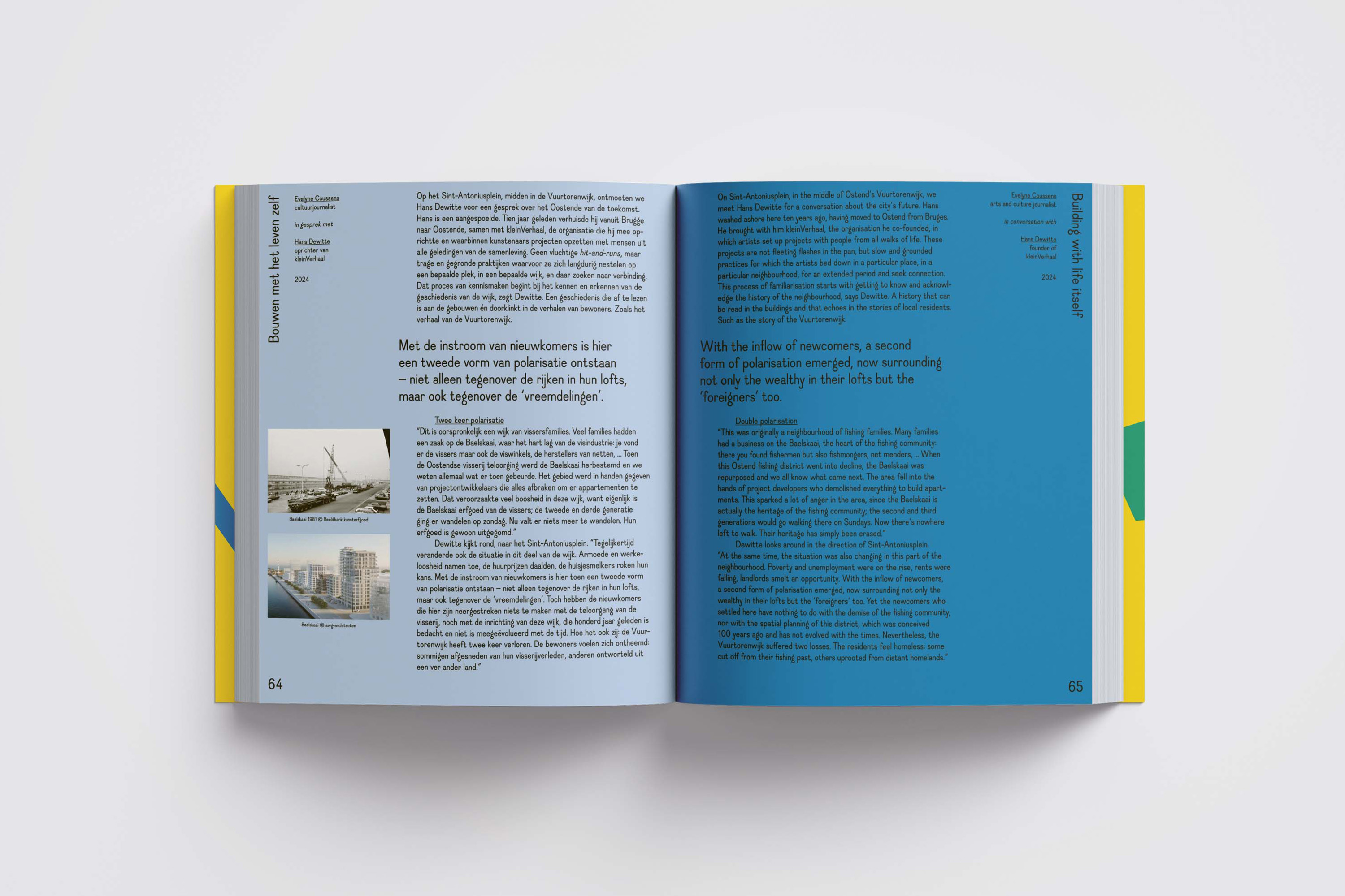
PUBLIEK PLAN — book — 2025


What if artists, designers, social workers and city residents collaborated to explore new ways to map and shape the city?
This book offers insight into the process of Publiek Plan, a project that took place between 2022 and 2025 in Ghent, Antwerp, Groningen and Ostend.
23,3 x 27,9 cm
210 pages
soft cover with flaps, swiss binding
edition of 500
published by CAMPUSatelier
December 2025
you can purchrase the book at
Copyright Bookshop, Boekhandel Limerick, Walry Boekhandel, De Groene Waterman, Passa Porta Bookshop, Z33 & Boekhandel Corman
Concept and design in collaboration with Elly Van Eeghem
Dauphine font designed by Charles Mazé & Coline Sunier
With the support of de Vlaamse Gemeenschap, Stad Gent, Kunstencentrum VIERNULVIER, Monty, VAi,
Buro Mix, Gemeente Groningen, De Grote Post, KASK
School of Arts Gent & BE PART Creative Europe
openbare werken — visual identity — 2025
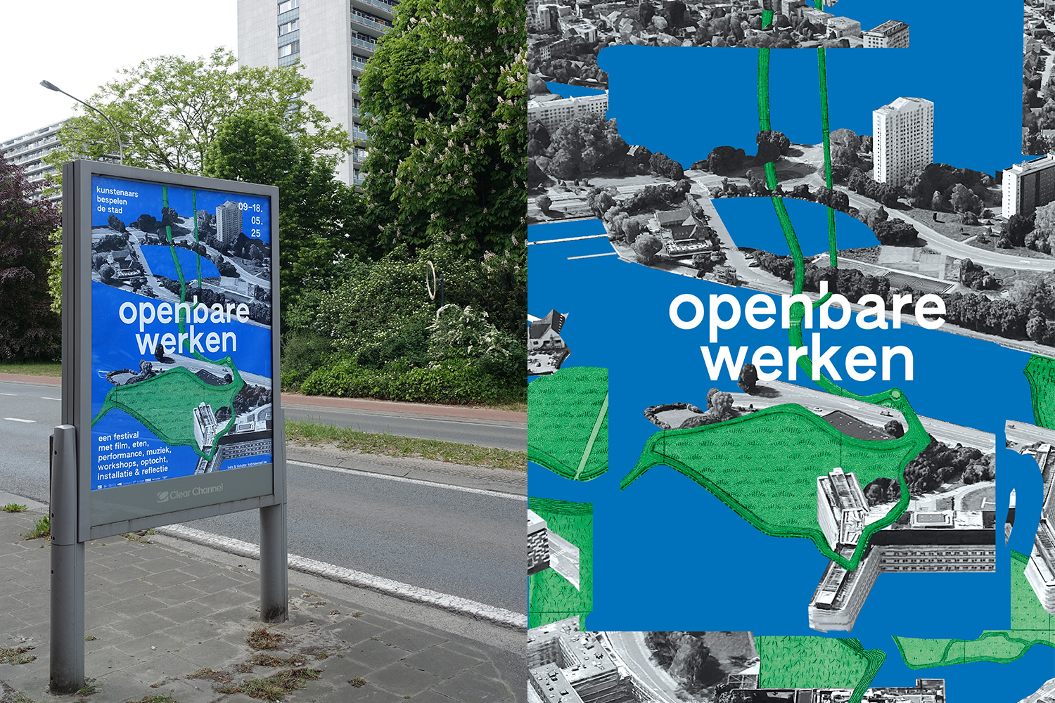
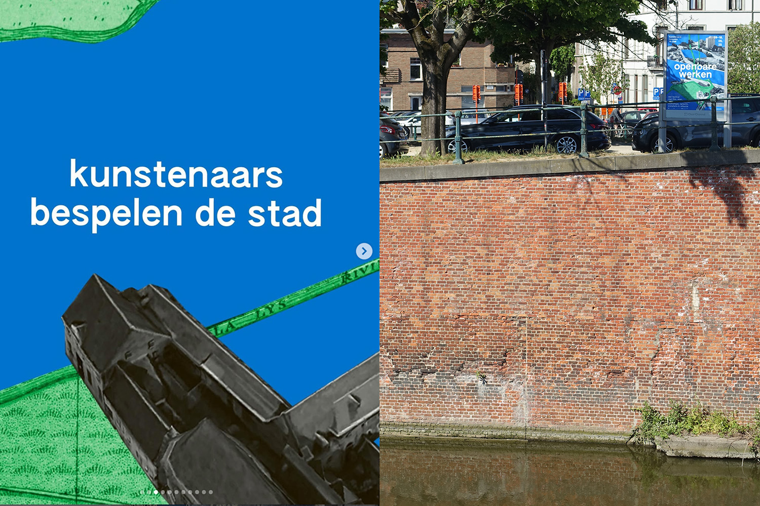
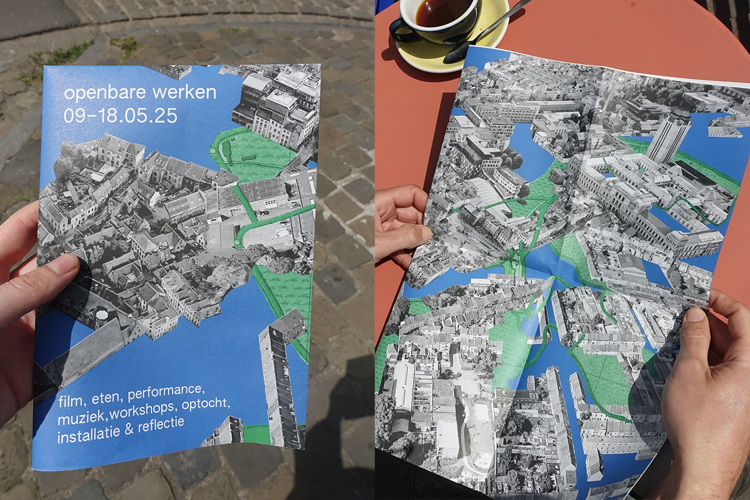

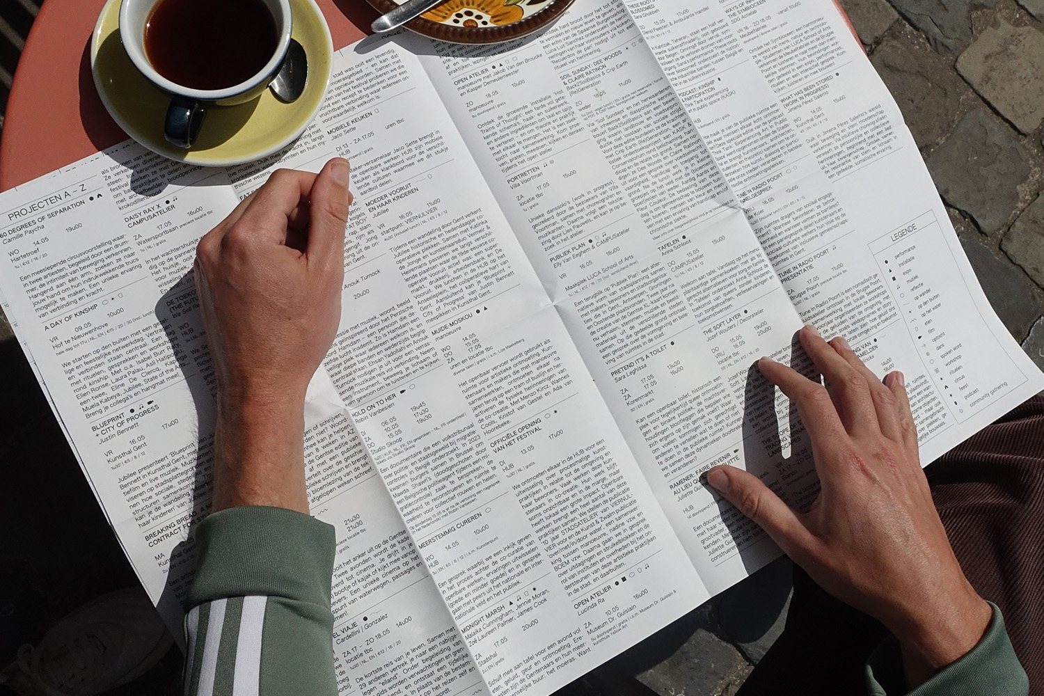
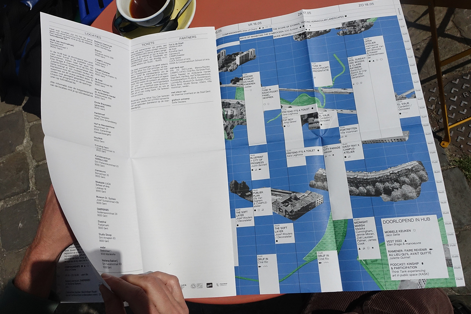
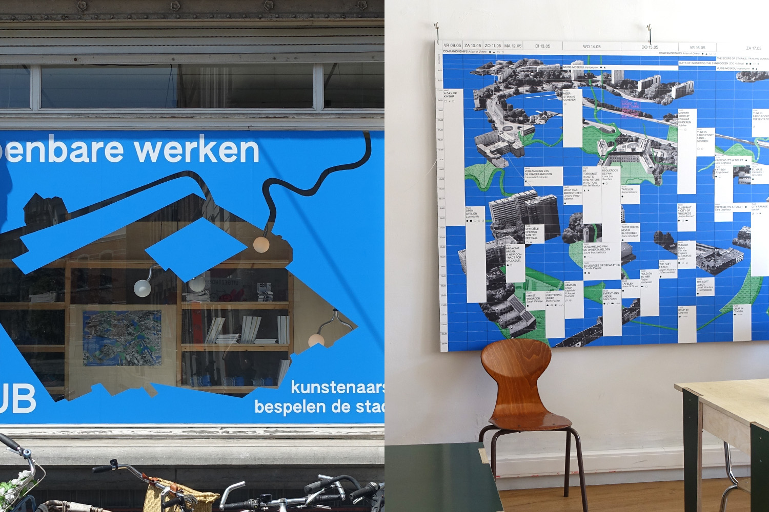
Poster, program & digital announcement for ‘openbare werken 2025’, an art festival that invites you to (re)discover the city. Art practices emerge in places where you don't always expect them and engage with public space, explore relationships, and take root in squares – with the swamp as an undercurrent and nourishment and kinship as a common thread.
Commisioned by Tot in de stad!: a collaboration between VIERNULVIER, de Koer, Kunsthal Gent, Manoeuvre, CAMPUSatelier, Jong Gewei, KASK & Conservatorium School of Arts en LUCA School of Arts
Commisioned by Tot in de stad!: a collaboration between VIERNULVIER, de Koer, Kunsthal Gent, Manoeuvre, CAMPUSatelier, Jong Gewei, KASK & Conservatorium School of Arts en LUCA School of Arts
Authentic Sans font designed by Christina Janus and Desmond Wong
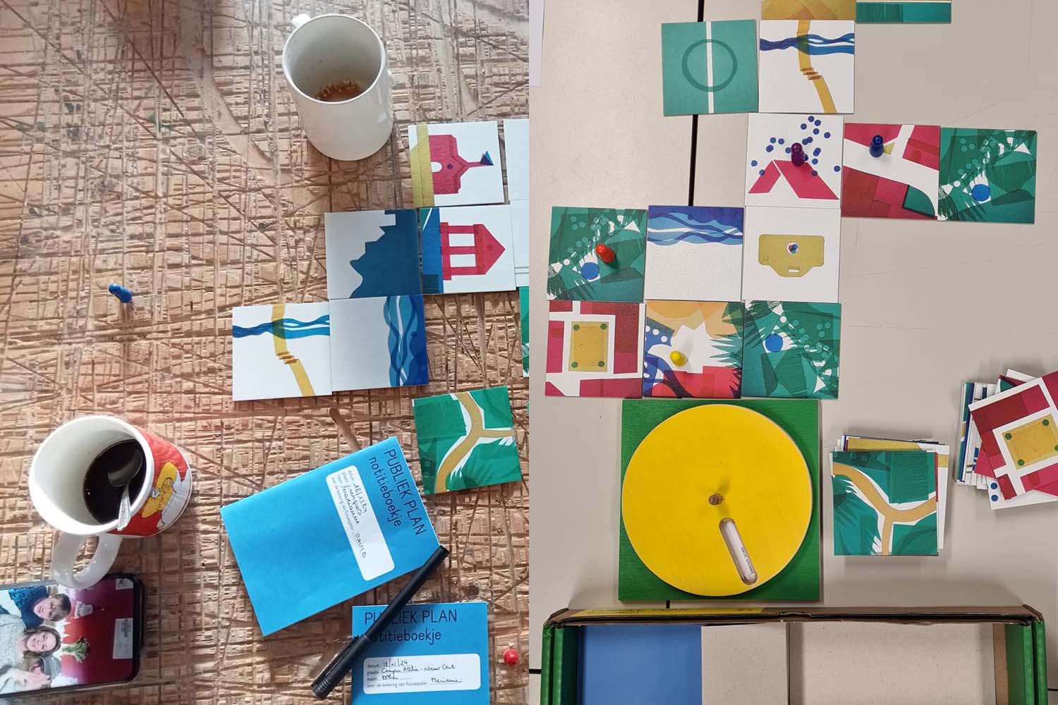
PUBLIEK PLANBURO — collective urban planning — 2024
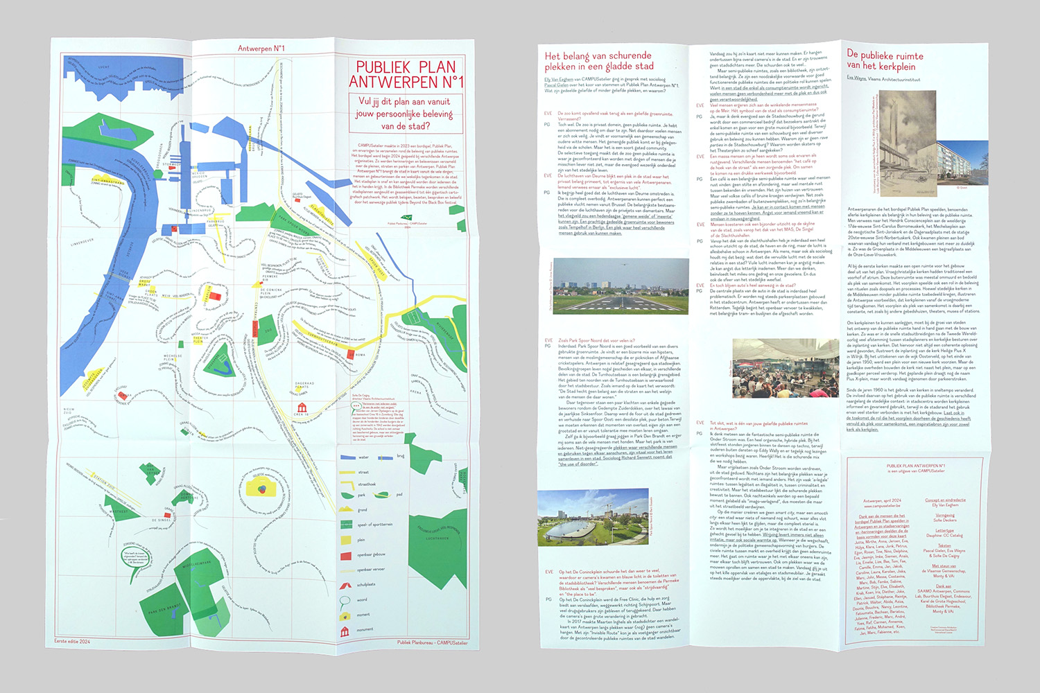

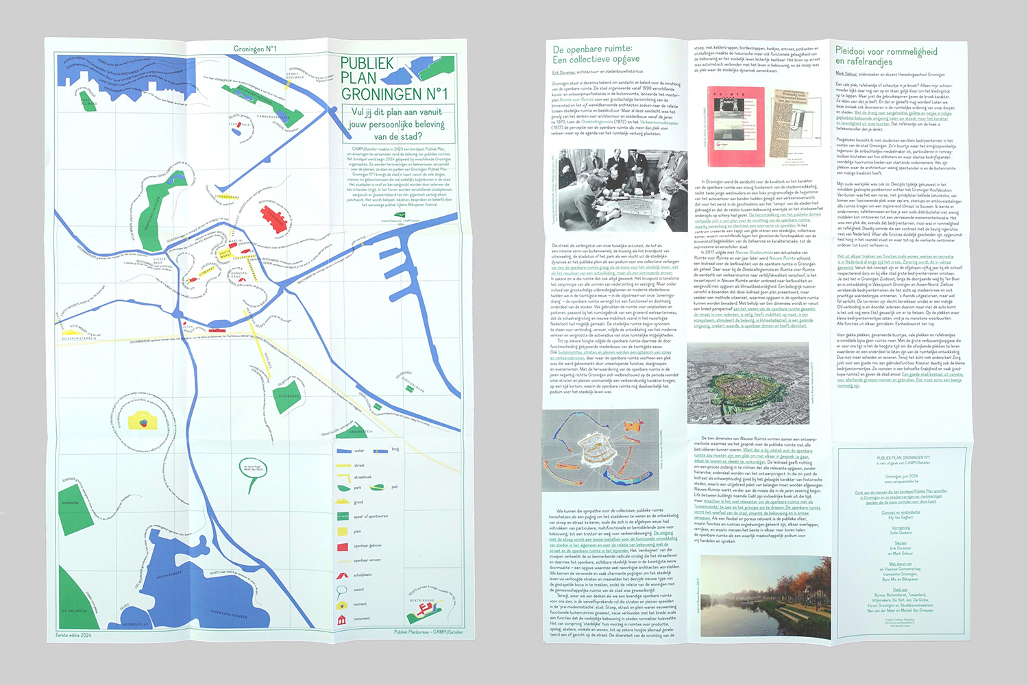
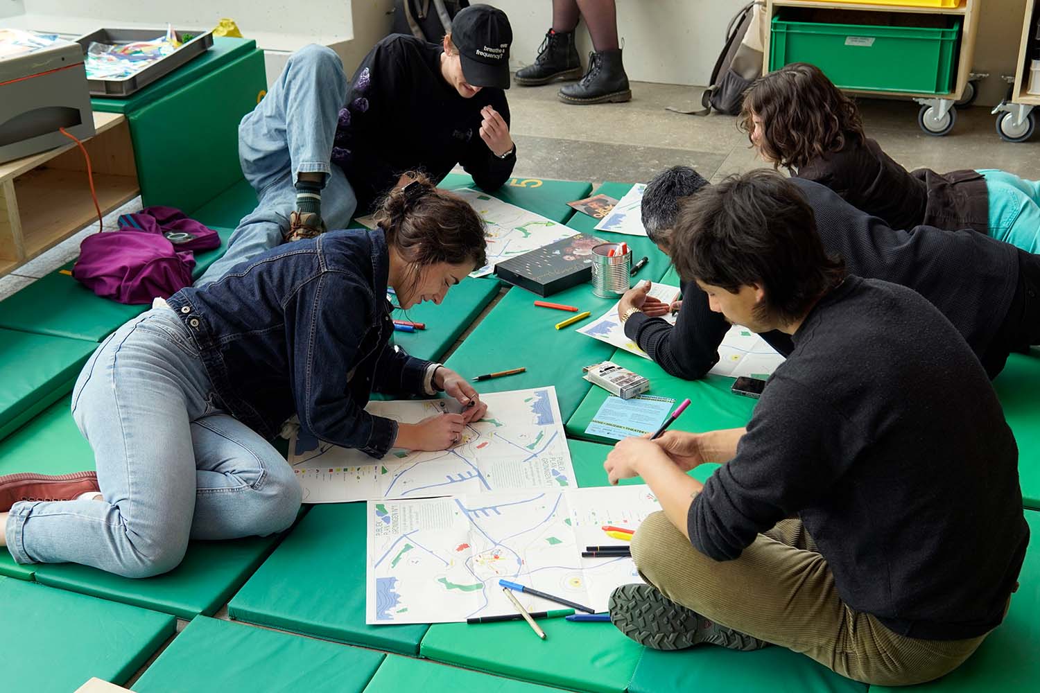

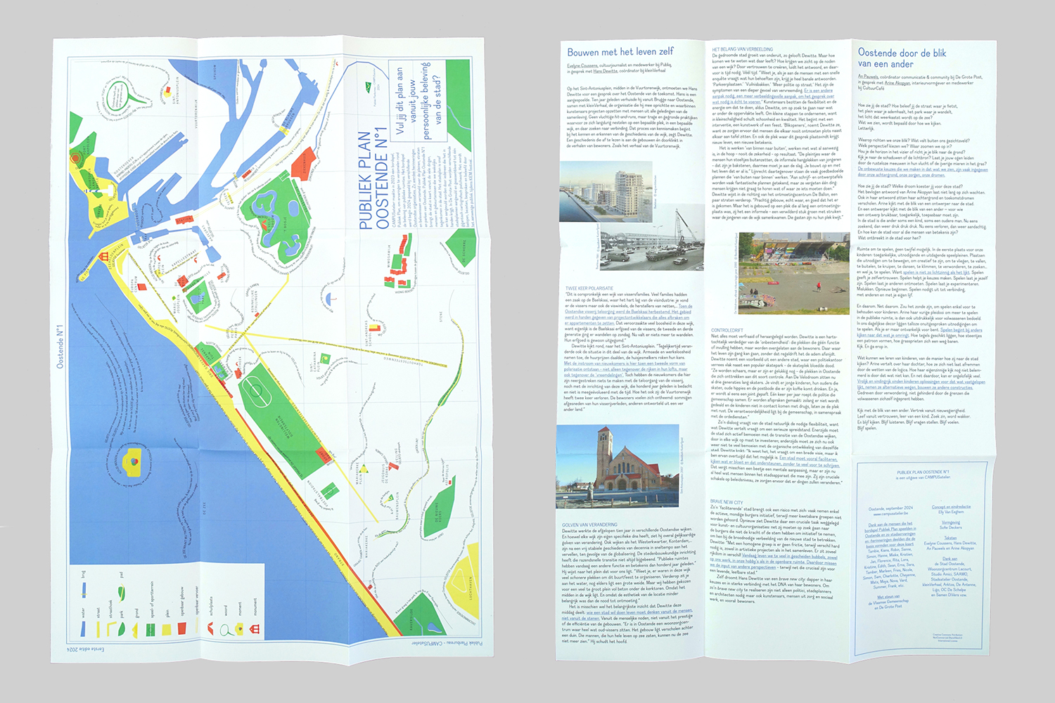

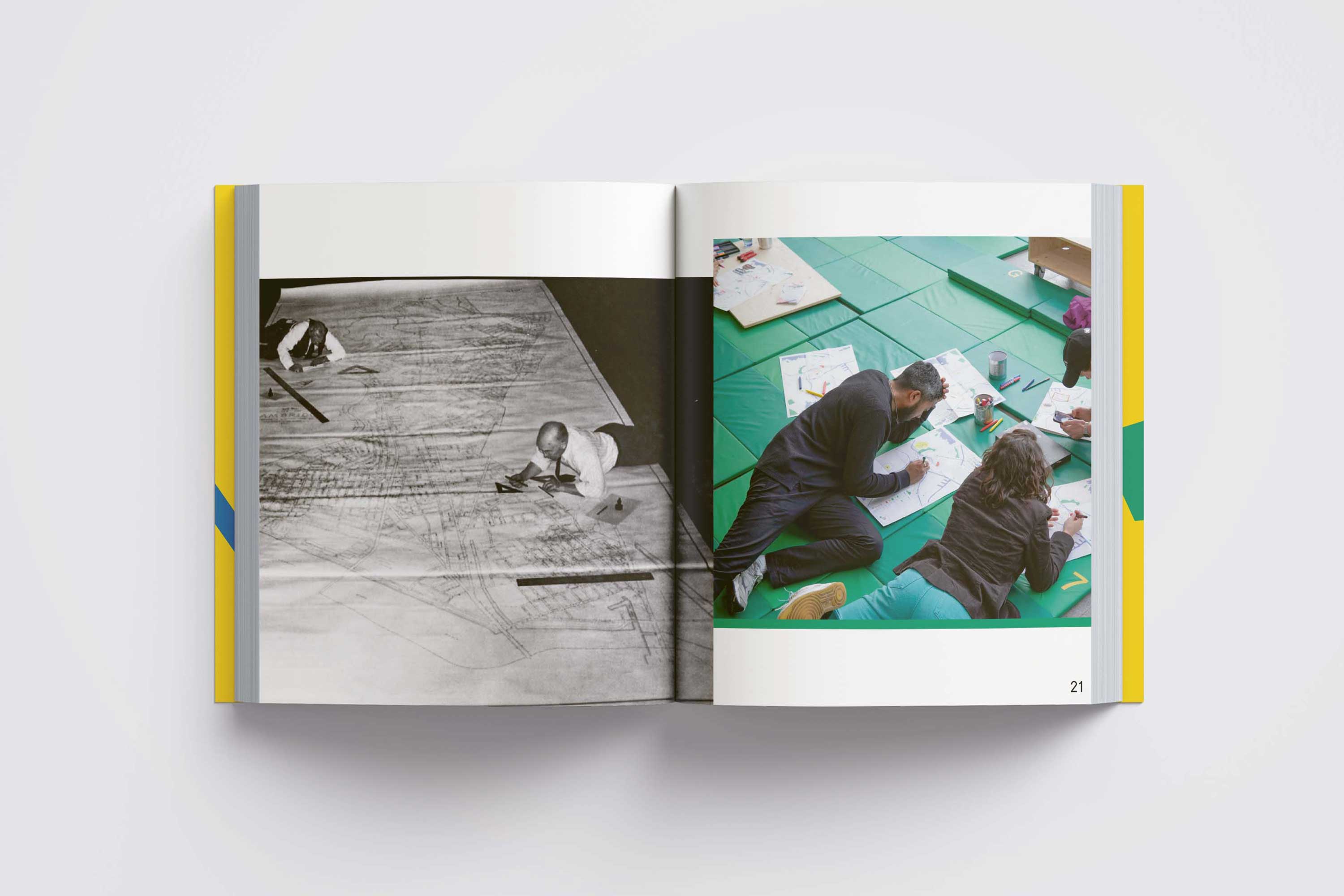
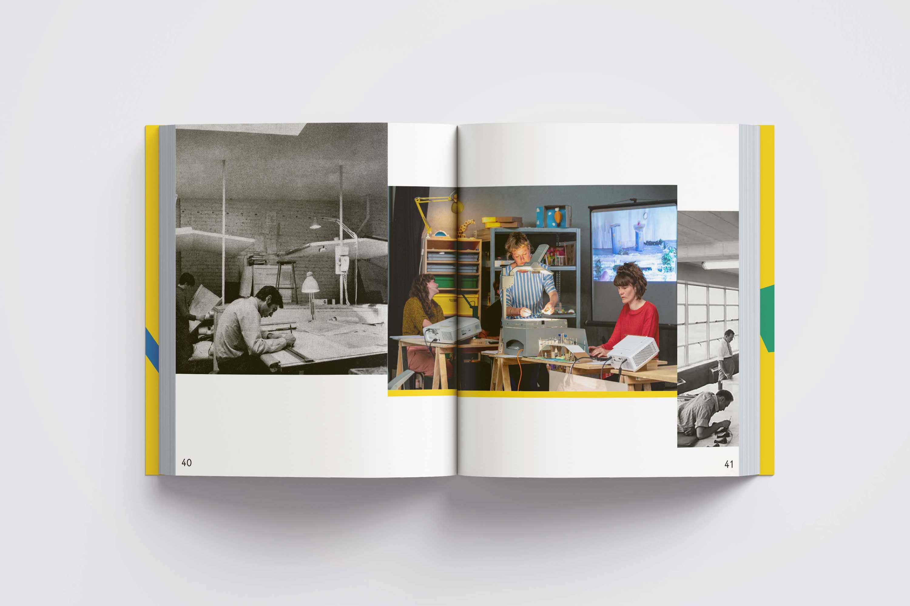
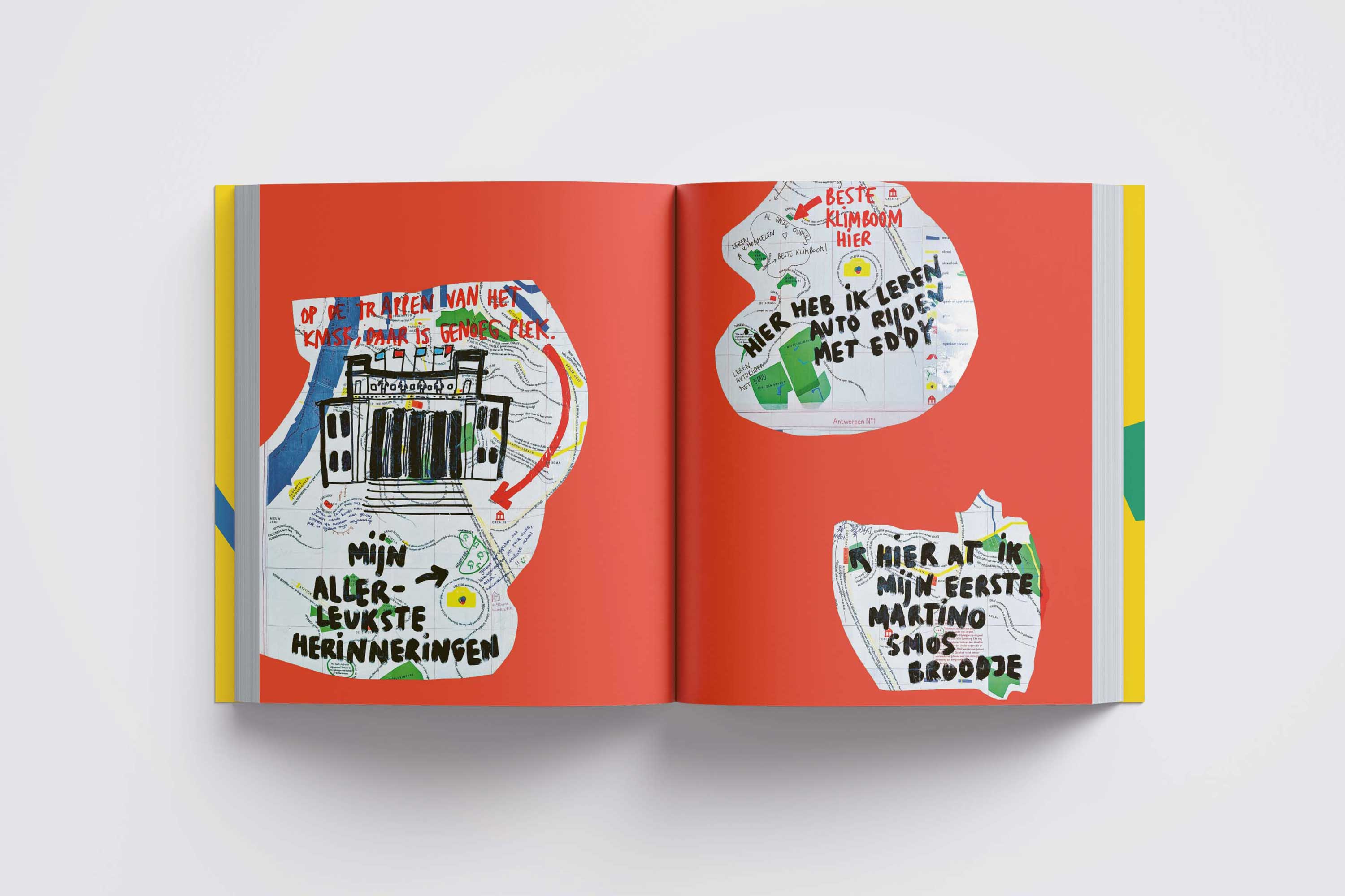
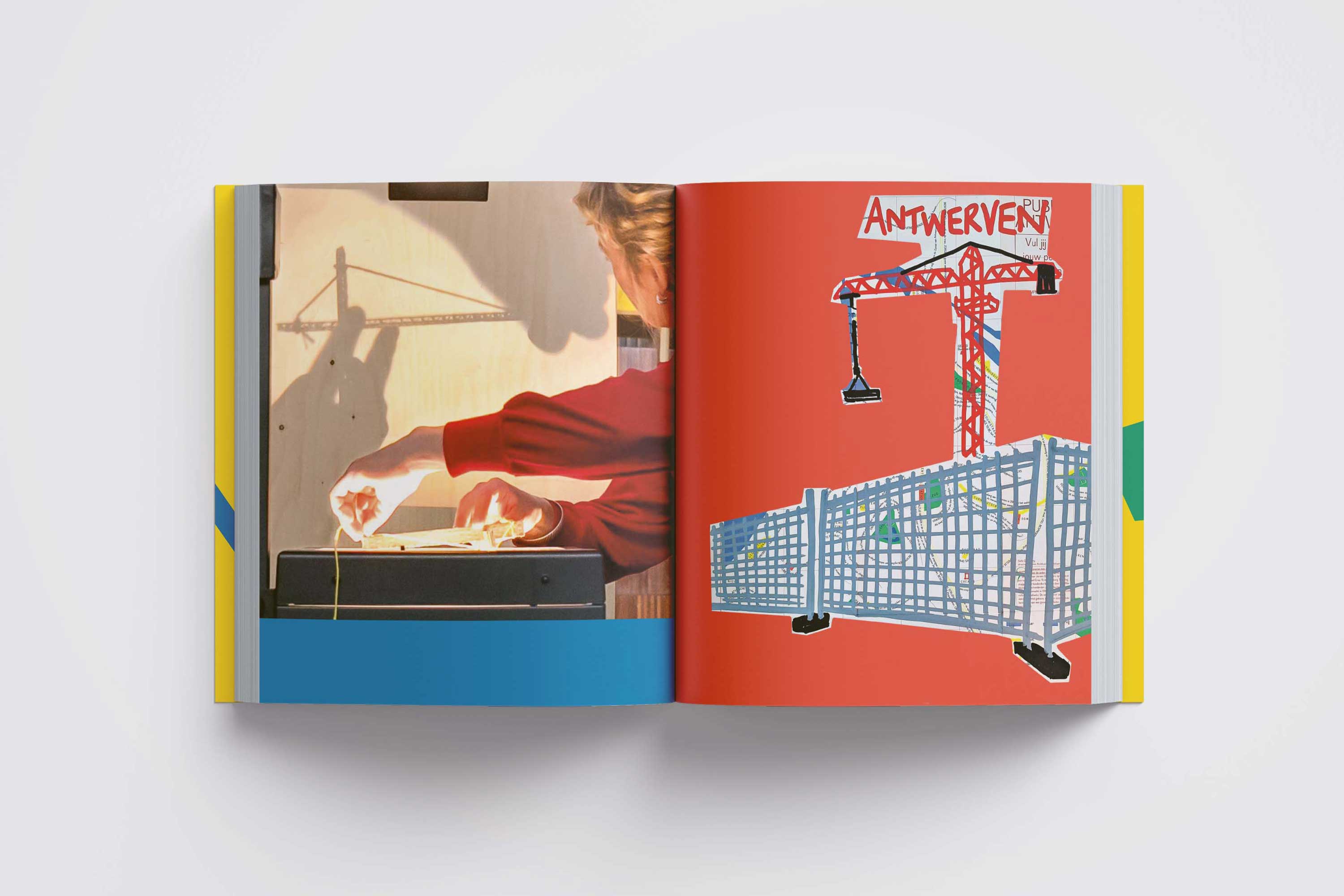
Through ‘Publiek Plan board game’, we collected personal urban experiences of residents and urban professionals in Antwerp, Groningen and Ostend and used these to make three incomplete city maps.
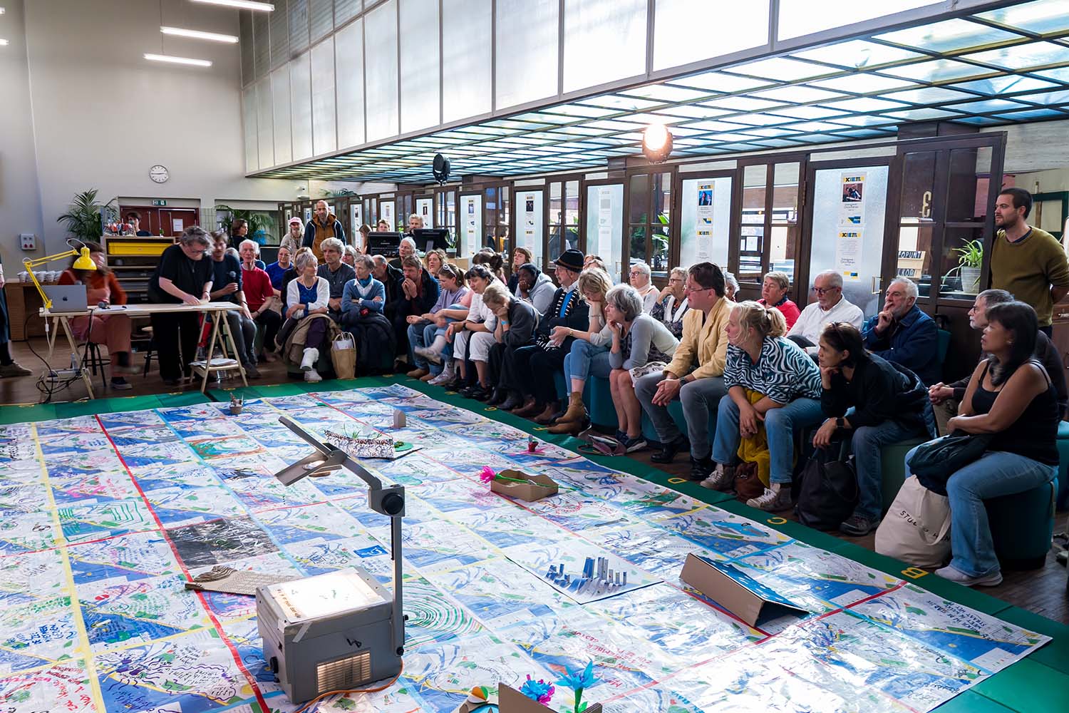
These city maps served as an invitation to further map the city during a travelling Publiek Planburo, during which we met people from the city and supplemented the incomplete maps together. At the end of each Public Planning office we gathered around a large pachwork-map and shared our collected stories.
Publiek Plan was initiated by Elly Van Eeghem, developed within CAMPUSatelier, and created in collaboration with Maarten Jolie, Jorik De Wilde, Ferre Van Bogaert, Merel Stolker, Joram Kunde Boumkwo, Toon Verdonck, Rona Kennedy, Ilke Bautmans, Klara Vanstraelen and Lennert Janssens
Last picture by Yvan Mahieu
Dauphine font designed by Charles Mazé & Coline Sunier
With the support of de Vlaamse Gemeenschap, Stad Gent,
Kunstencentrum VIERNULVIER, Monty, VAi, Buro Mix, Gemeente Groningen, De Grote Post, KASK School of Arts Gent & BE
PART Creative Europe
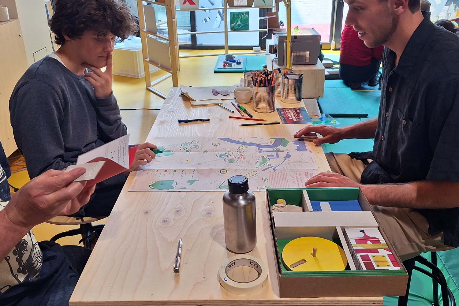
PUBLIEK PLAN — board game — 2023

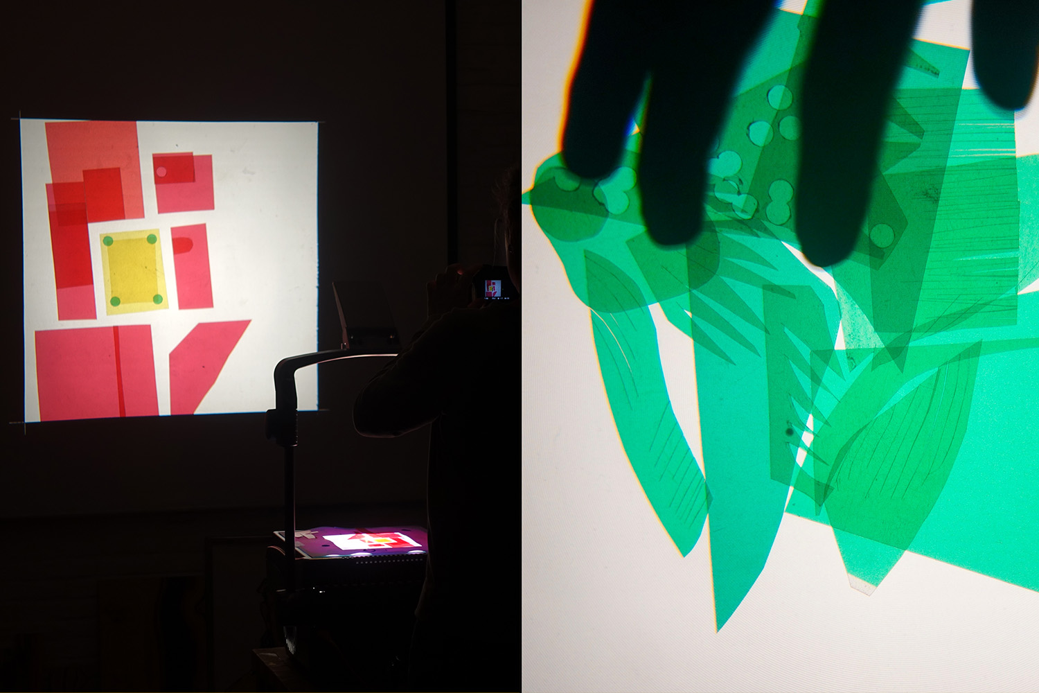

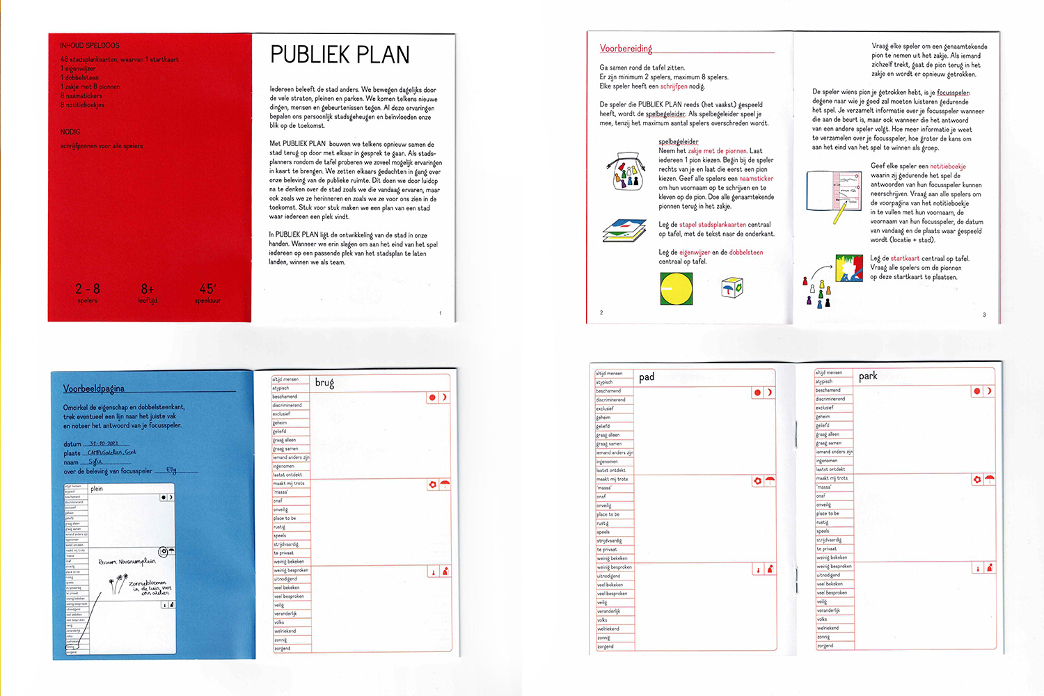

Publiek Plan board game initiates a conversation about the city we live in. It makes us think out loud about the streets, squares, parks we move through every day. By playing the game we trigger each other’s thoughts about our public space: where we meet and experience: today, as we remember it and as we would like it to be in the future.
Concept in collaboration with Elly Van Eeghem, Maarten Jolie & Ferre Van Bogaert